CF / PortfolioOwned product / Live

FewerTools / Product strategy, UX and front end

Software stacks keep growing.Decisions don't.

A live product that helps founders see overlap, waste and gaps without sitting through another software sales call.
My role
Founder, positioning, product UX, interface and front end
Constraint
Make a complicated stack understandable in one short session
Status
Live and updated publicly
fewertools.com
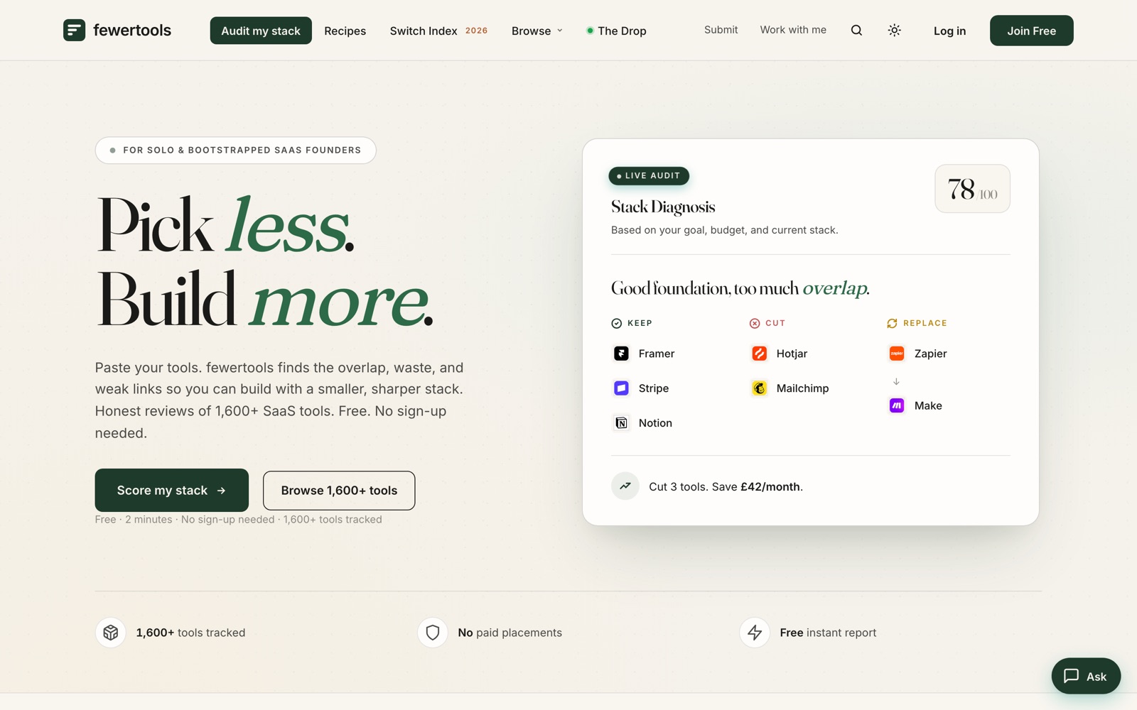
FewerTools software audit interface

Case study anatomy / 01

The six questions behind the interface.

01 / Problem
Teams accumulate overlapping tools and cannot see what to cut without risking a workflow they still need.
02 / Thinking
Start with the current stack, diagnose overlap, show a verdict, then keep the reasoning beside it.
03 / Business
Reduce avoidable software spend while protecting the work the team still needs to do.
04 / Users
Founders and small teams who own software costs without a procurement department.
05 / Constraints
A large catalogue still has to feel quick, legible and explainable in one short session.
06 / Outcome
A public responsive product with 1,696 catalogue tools and 670+ editorial verdicts maintained as countable evidence.

The product problem / 02

A directory gives people more options. The product needed to help them remove some.

Most software discovery starts with categories and ends with another shortlist. FewerTools begins with what a company already uses and asks where those tools repeat the same job.

The design had to make the result quick enough to finish, but clear enough to trust. That pushed the product toward a diagnosis with evidence rather than an endless catalogue.

Product decisions / 03

Less software. More signal.

01

Diagnose before browsing

The useful question is not which tool looks interesting. It is where the current stack overlaps, wastes money or leaves a gap.

02

Make the verdict visible

Keep, cut and replace gives every recommendation a job. The interface is organised around the decision, not a wall of software logos.

03

Show the reasoning

Editorial verdicts and category context sit close to the recommendation so the result feels explainable, not generated from nowhere.

Core journey / 04

From a messy list to one next move.

The interface keeps every stage legible: add the current stack, group the work it performs, inspect overlap, then leave with a prioritised action.

  1. 01Add the stackStart with the tools already in use.
  2. 02Find the overlapSee repeated jobs and underused categories.
  3. 03Read the verdictUnderstand why each tool should stay, go or change.
  4. 04Take one actionLeave with a short priority, not another browse session.

Current product evidence / 05

The product is public. The evidence is countable.

1,600+tools tracked
670+editorial verdicts published
01responsive product in active use

The evidence available today is the live product, the working diagnosis and the scale of the maintained catalogue. A verified user cohort and reporting window are the next layer of measurement.

What I owned / 06

One product, all the awkward joins included.